Share Components across Front Ends frameworks using Nx and Web Components - Part 3

This is the third of a three parts Guides:
- Part 1 - Project Setup and Introduction to Web Component
- Part 2 - Add Custom Style and Property Binding
- Part 3 - Output Event and Allow Retrocompatibility.
Part 3 - Output Event and Allow Retrocompatibility
In part one, we introduced Web Components, what they are and how to use them. We also created and set up an Nx workspace with an Angular and React project alongside a shared Web Components library. We created a custom element that "listens" to the attribute title and changed the DOM content accordingly. The second part added some custom styles and showed how to pass complex objects via attribute and property.
This final section will focus on Events and listening to them in our app and Polyfill to allow our web component to work on old browsers.
1. Dispatch and receive Events
If you follow the previous three parts, you should already have your monorepo setup with your shared library and the Angular and React app ready. We are going to create a new shared Web Component to showcase events. A simple counter that increments on button click and dispatches an event with the current value outside of the component.
let's start with the template, nothing new here :
const template = document.createElement('template');
template.innerHTML = `<style>
#count {
color: red;
}
</style>
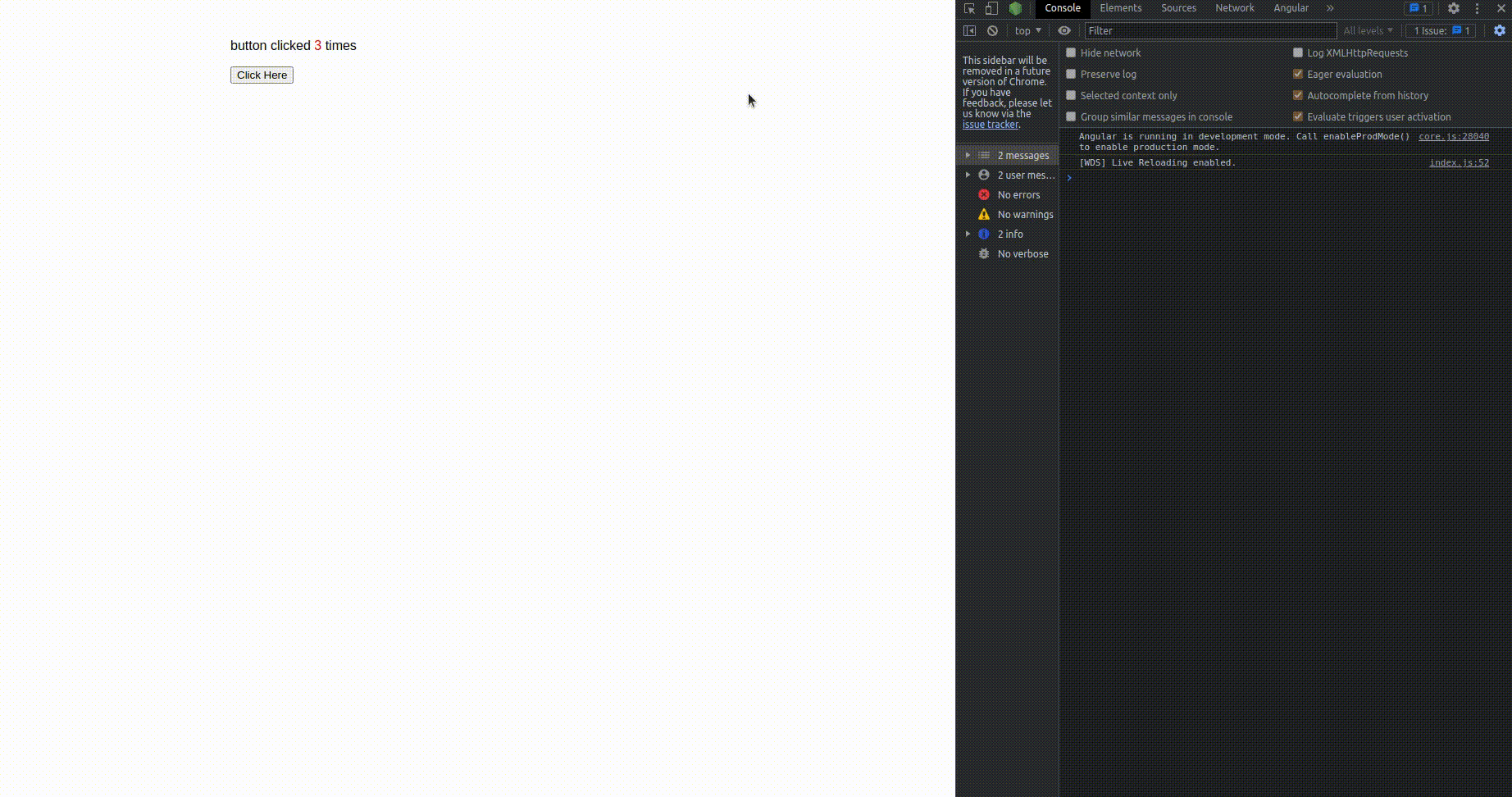
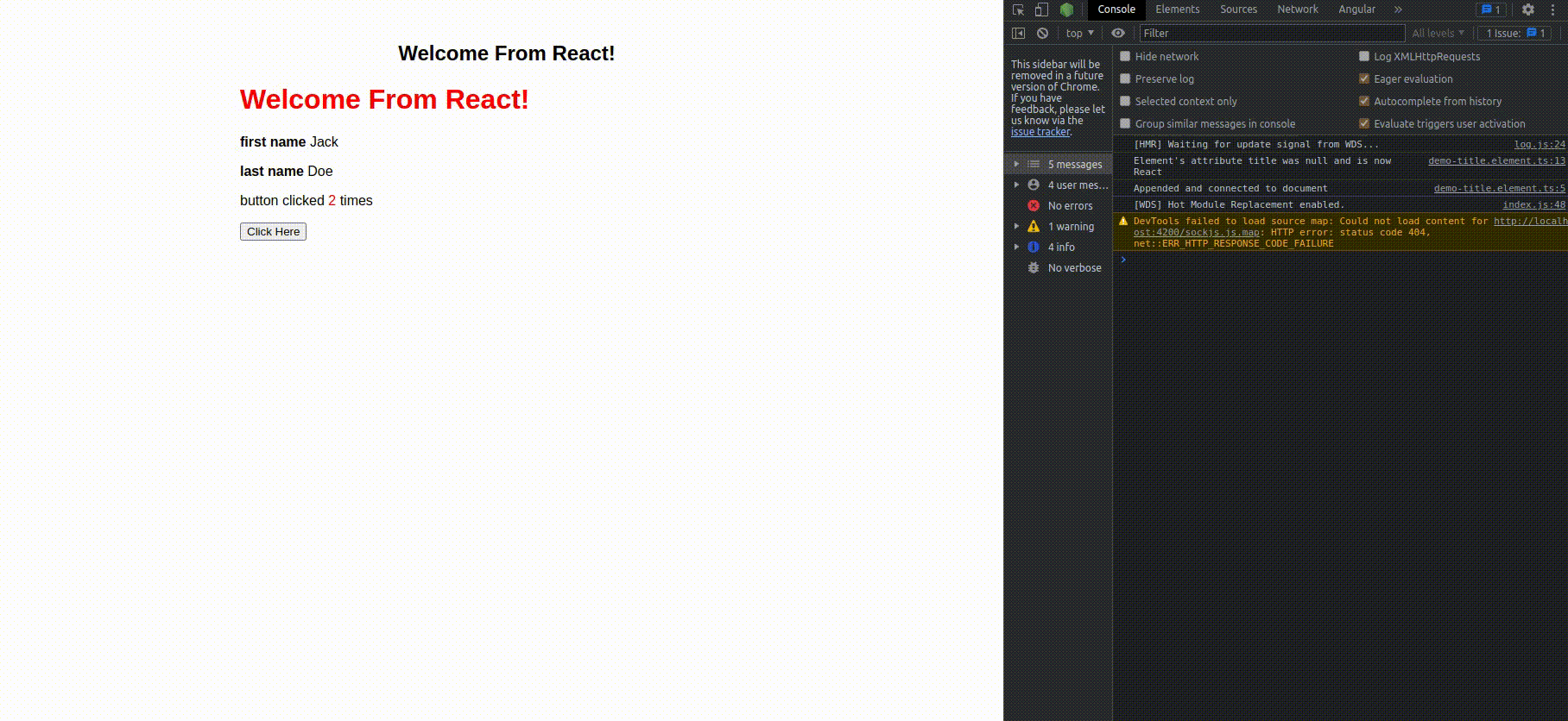
<p>button clicked <span id="count">0</span> times</p>
<button id="btCounter">Click Here</button>`;
Let's create the component code, a counter with an optional initial value, which will increment according to each button click. There is nothing new here :
export class DemoCounterElement extends HTMLElement {
  private _count = 0;
  get count(): number {
    return this._count;
  }

  set count(val: number) {
    this._count = val
    this.update(this._count);
  }

  constructor() {
    super();
    this.attachShadow({ mode: 'open' });
    this.shadowRoot.appendChild(template.content.cloneNode(true));
    this.shadowRoot.getElementById('btCounter').onclick = () => this.increment();
  }

  increment() {
    this.update(++this.count);
  }

  update(count: number) {
    this.shadowRoot.getElementById('count').innerHTML = count.toString();
  }
}

customElements.define('demo-counter', DemoCounterElement);
Export this component from your library (remember it's the index.ts) and import it in Angular and react :
In our Angular component template (we start counting from 1):
<demo-counter [count]="3"></demo-counter>
And in our React component (we start counting from 2):
export function App() {
  const counter = useRef<DemoCounterElement>(null);

  useEffect(function () {
    if(counter.current) {
      counter.current.count = 2;
    }
  }, []);

  return (
    <div className={styles.app}>
      <demo-counter ref={counter} />
    </div>
  );
}

export default App;
If you start both apps, it will already increment the counter on each click, but we would like to get notified outside of our Web Components when users click the button. To do this, we will need to dispatch a Custom Event from our Web Component and listen to it in our apps. Custom Event is an interface representing events initialized by an application for any purpose.
In our Web Component increment method, let's create and dispatch a new custom Event.
  increment() {
    this.update(++this.count);
    this.dispatchEvent(new CustomEvent<{ count: number }>('incremented', {detail: { count: this.count }}));
  }
We use detail to pass any data we would like to share from this event. detail will be readonly once the event is initialized.
With this simple change, let's update our Angular and React to log the event in the console.
In Angular template, we can now bind the event :
<demo-counter [count]="3" (incremented)="clicked($event)"></demo-counter>
and in the component code :
  clicked(event: Event) {
    console.log(event)
  }
For React, things are not as simple. Our event is not a native one, and there is currently no simple way (as far as I know) to listen to that event directly from the template. You will either need an additional library like xeact or use the ref as we did for the properties. There are several issues in the React repository asking for easier management of custom events, but none have been implemented yet.
So we will use the useRef hook and the useEffect to add and remove our listeners.
export function App() {
  let eventRef: DemoCounterElement;
  const counter = useRef<DemoCounterElement>(null);

  const onIncrement = (e) => {
    console.log(e)
  }

  useEffect(() => {
    const counterRef = counter.current;
    if(counterRef) {
      counterRef.count = 2
      counterRef.addEventListener('incremented', onIncrement)
    }
    return () => {
      if(counterRef) {
        counterRef.removeEventListener('incremented', onIncrement)
      }
    }
  })


  return (
    <div className={styles.app}>
      <demo-counter ref={counter}/>
    </div>
  );
}
Fire your app up again and check your console. Your log should appear in your React app.
Great, now you can pass attributes, properties and dispatch custom events from your Web Components! One last thing is left for us, adding Polyfill to make them compatibles with old browsers.
2 Add Polyfill
To ensure compatibility with older browsers, it is necessary to include a Web Components polyfills. Now, this is not a requirement, and it is OK only to target new browsers. The choice is up to you and your needs. As Angular says, "polyfills cannot magically transform an old, slow browser into a modern, fast one.", and the latest Angular 13 recently dropped support for IE11.
If you wish to allow an old browser to use your app, you will need to set up some polyfill to add additional code to the page and not break modern features that were not available before. Angular and React do not come with a specific polyfill for web components; we will have to add one manually. Luckily, there is a pretty popular repository that will do everything for us.
In your project, install @webcomponents/webcomponentsjs
npm install --save @webcomponents/webcomponentsjs
We now must load our Polyfill in Angular and React. For this feature, both frameworks work similarly.
Angular and React come with a file named polyfill.ts, which you will find in both projects src folders. We can add our Polyfill inside the file directly, and it will be loaded on pre es5 browsers.
Be sure to use the correct path.
polyfill.ts
 import "@webcomponents/webcomponentsjs/custom-elements-es5-adapter.js"
 import "@webcomponents/webcomponentsjs/webcomponents-loader.js"
You should be ready to go. You will need an old machine or a VM to test this or some testing service like lambdatest.
3 Conclusion
That is it for this series. You can now create your fully customized HTML elements and use them across various projects. While Web Components are not replacing current frameworks, they can be a great tool to complete them for things like shared UI library. I hope you learned something and that you enjoyed my firsts ever blog post series. Thank You!
You can find the entire repo here :
Found a Typo or some problem?
If you’ve found a typo, a sentence that could be improved, or anything else that should be updated on this blog post, you can access it through a git repository and make a pull request. Please go directly to https://github.com/Crocsx/dev.to and open a new pull request with your changes.


